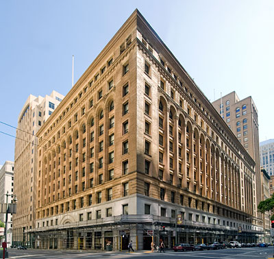
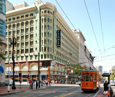
Chicago School (1890-1920)
The Chicago School is also known as the Commercial Style and the American Renaissance Style.
In the last quarter of the 19th century, architects and engineers in Chicago developed the steel-frame skyscraper that would become the emblematic building of the 20th century.
A commercial Chicago School building was taller than its masonry neighbors, usually more than six stories and as tall as twenty stories. Chicago School buildings were rectangular with a flat, corniced roof. Because the exterior wall were not load bearing, they had large areas of glass, terra cotta or other ornamental finish.
Louis Sullivan was the most influential architect of the Chicago School. His buildings, like a classical column, had a base or several stories, a shaft arranged in vertical bands, and an elaborate cornice of several stories.
Distinctive features are:
- large arched windows
- decorative terra cotta panels
- decorative bands
- vertical strips of windows with pilaster-like mullions
- highly decorated frieze

Chicago School Office Buildings in San Francisco
The first tall, steel-framed office buildings were built in San Francisco in the 1890s. The facades of these buildings were organized as columns (base, shaft, capital) and clad in terra cotta. Notable examples are the Mills Building and Chronicle Building, both by Burnham & Root.
Fourteen such buildings, which still survive in one form or another, had been built or were being constructed at the time of the 1906 Earthquake and Fire. One lesson learned from that catastrophe was that steel frames and terra cotta cladding survive these awful tests remarkably well. For the next decade, the San Francisco was rebuilt with many of these buildings, usually with historicist imagery to define the base, shaft and capital.
Splendid Survivors, published by The Foundation for San Francisco's Architectural Heritage, identifies eighteen such office buildings of ten stories or more, constructed between 1906 and 1919. In the building boom of the 1920s this type continued, but taller on the average than before. After 1925 the first type was joined by the stepped-back skyscraper inspired by New York City building and zoning codes and by Eliel Saarinen's second-place design for Chicago's Tribune Tower, for a total of twenty tall office buildings in the decade.
Excerpted from the NRHP nomination for the Matson Building dated 23 October 1995.

Architectural Terra Cotta in San Francisco
Architectural terra cotta had long been used in San Francisco as ornament, but after the 1906 Earthquake and Fire, the material began to be considered both as a substitute for brick or stone and as a versatile medium in its own right. The Hearst Building of 1909, for instance, displayed fourteen stories of polychrome terra cotta above a two-story marble base. In 1914, only a year after the success of New York's terra cotta-clad Woolworth Building, Willis Polk sheathed the Hobart Building entirely in terra cotta with dense ornament.
For a variety of reasons, terra cotta became the dominant cladding material for tall buildings constructed in San Francisco between 1920 and the Depression.
First was its light weight. The material could be manufactured in hollow blocks with cell walls only one to two inches thick. These blocks could be laid up against common brick masonry efficiently, and tied back to the masonry with thin steel wires. By contrast, stone facings of the time were at least four inches thick, and their metal anchors were correspondingly heavy.
Second was the quality of its manuacture, which rose as temperature-controlled kilns and perfectly mixed clays were developed. Identical blocks for uniform bays between steel columns could be designed, formed, baked, glazed, and delivered to a job site predictably, without the hand finishing that stone masonry still required.
Third, and most important, were the expressive possibilities. The variety of color, texture, and sheen available to surface terra cotta was limited only by the number of glazes which could be fired onto baked clay. If a designer sought a stone-like appearance, he could be assured of a material which accurately simulated the visual quality of stone. If he wished to emphasize color or reflectivity, he could obtain an appearance never available in stone or brick.
Excerpted from the NRHP nomination for the Matson Building dated 23 October 1995.
| Name | Year | Address | City | Sort Address | Sort Name |
|---|---|---|---|---|---|
| Citizen's Banking & Trust | 1910 | 232-242 East Main Street | Ashland, OR | Main E 0232 | Citizen's Banking & Trust |
| Commercial and Savings Bank | 1915 | 343 Main Street | Stockton | Main 0343 | Commercial and Savings Bank |
| Enders Building | 1910 | 250-300 East Main Street | Ashland | Main E 0250 | Enders Building |
| Farmer's and Merchant's Bank | 1917 | 11 South San Joaquin Street | Stockton | San Joaquin 0011 | Farmer's and Merchant's Bank |
| Gold Hill High School | 1911 | 806 6th Avenue | Gold Hill. OR | Avenue 06 0806 | Gold Hill High School |
| Hotel Regis | 1912 | 1024-1030 K Street | Sacramento | Street K 1024 | Hotel Regis |
| Lettunich Building | 1914 | 406 Main Street | Watsonville | Main 0406 | Lettunich Building |
| Liberty Building | 1909 | 201 West Main Street | Medford | Main W 0201 | Liberty Building |
| Matson Building | 1923 | 215 Market Street | San Francisco | Market 0215 | Matson Building |
| Mills Building and Mills Tower | 1890 | 220 Montgomery Street and 220 Bush Street | San Francisco | Montgomery 0220 | Mills Building and Mills Tower |
| Pacific Building | 1907 | 801-823 Market Street | San Francisco | Market 0801 | Pacific Building |
| Pacific Gas and Electric General Office Building | 1923 | 245 Market Street | San Francisco | Market 0245 | Pacific Gas and Electric General Office Building |
| Sweasey Theater | 1920 | 412 G Street | Eureka | Street G 0412 | Sweasey Theater |
| YMCA Hotel | 1928 | 351 Turk Street | San Francisco | Turk 0351 | YMCA Hotel |
| Sharon Building | 1912 | 39-63 New Montgomery Street | San Francisco | New Montgomeryn 0038 | Sharon Building |

